Loud Community
Loud Community is the brainchild of Veronica Tolentino. She noticed a gap in the community for people of color who identify as female to feel supported and heard. It functions as a member-based league of women and non-binary folx, but also hosts workshops and provides educational resources. Loud is committed to creating the world we want to see through community-driven transformation. The community’s goal is to cultivate joy through friendship, self-development, and provide access.
Check out the Loud Community Instagram for a fuller scope of meaningful work.
/ Branding
/ Art Direction
/ Web Design
/ Social Media Content
[2018 - today]


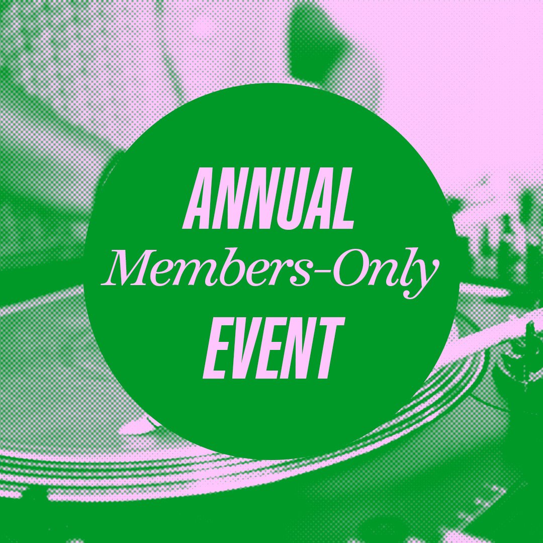
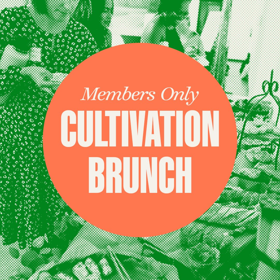
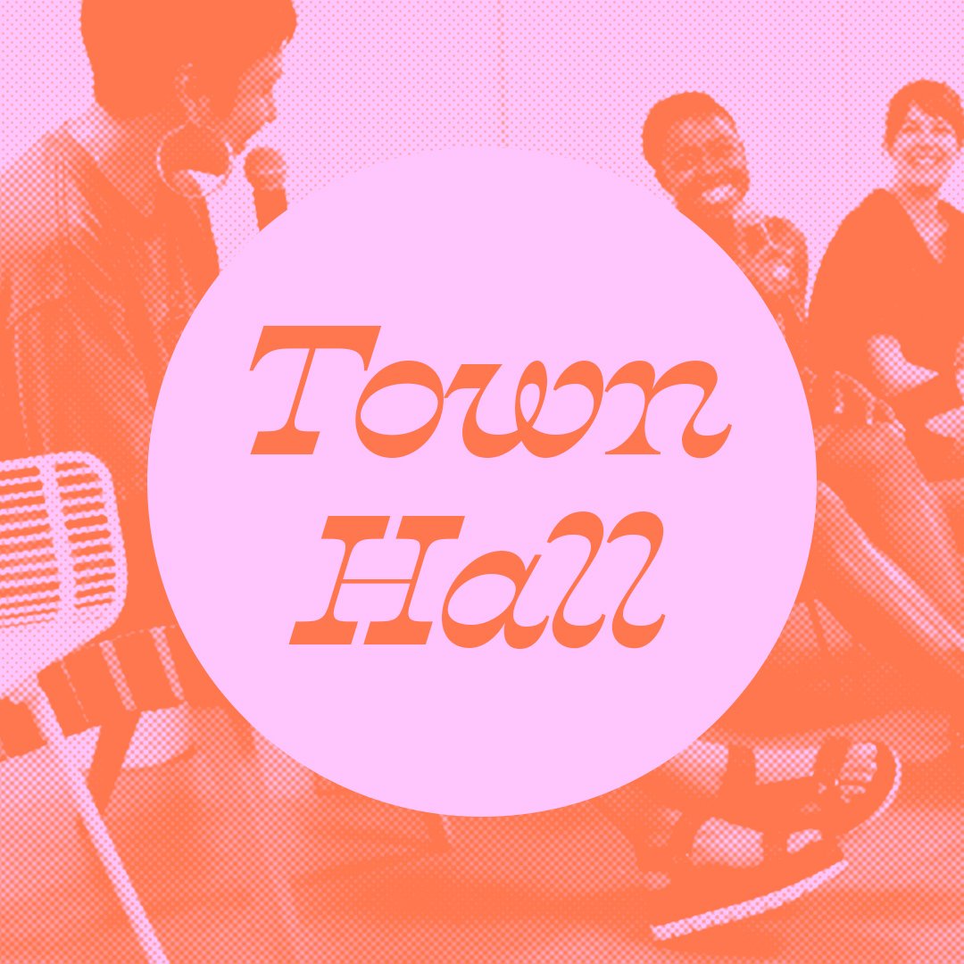
Veronica has been told she was too “Loud” and opinionated her entire life. Hence, Loud, a space where BIPOC voices are lifted, not belittled. The branding needed to be bold but relatable to reflect the personalities of the community members. We worked together to create a system to engage others and welcome them in. As humans, we need consistency to create trust, hence the importance of brand identity. Loud’s content is meant to enlighten women and make them feel empowered + supported. We put a system in place for women’s quotes to be statement pieces, and infographics to be educational. Bold, contrasting fonts and colors are one of the many ways we achieved this.
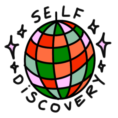
The Loud Logo is a hand drawn font, warped through the middle. We wanted something that symbolized disruption, connection, and fearless imperfection.
FONTS IN USE:
Kaneda
Temeraire


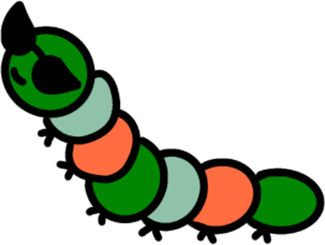
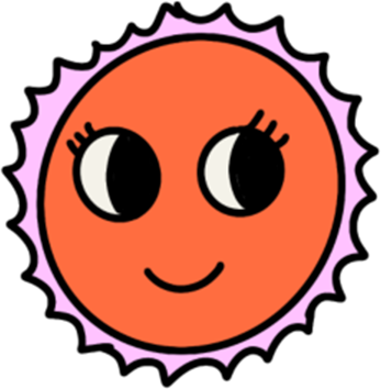
The website needed to be interactive for new users and community members. We didn't want just another obvious female centric website. I created a gallery of fun graphics and characters, to give the website personality. We acknowledge and are influenced by what’s happening around us but in an individualize sense, highlighting our community but having fun the way we like to.
Loud Website Mini Tour


