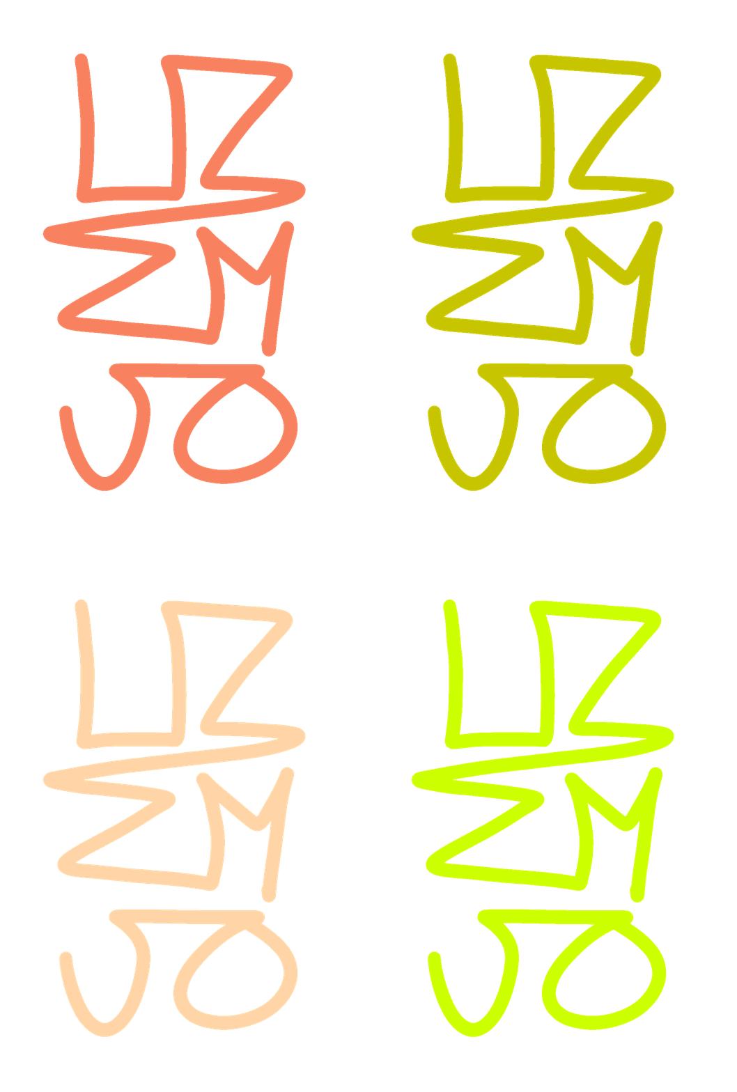
No going back la
The Committee for Greater LA came together earlier this year to understand the effects that COVID had on different populations throughout Los Angeles County. They needed eye-catching branding to reflect the creative nature of this venture. They wanted to capture the youth and bring attention to the discrepancies very much present in Los Angeles. Their goal is to present stats and facts in an engaging way.

The main No Going Back Logo is formatted in a narrow bold typeface, making a bold impact, a statement. It has a youthful edge but remains timeless like politcal posters throughout history. The city is formatted in Helvetica Neue. These two fonts costrast and compliments each other. Narrow and wide, thin and thick. Helevetica is also paying tribute to Subway and Metro stations, being the main font used in many metropolitan areas, alluding to the movement of modern cities.
The colors are inspired my the colors used in Metro/Subway lines. This fruther ties the idea of movement and community of metropolitan areas. The colors are bright and lively. Eye-catching and hopeful.
FONTS IN USE:
Dharma Gothic E
Helvetica Neue


